Showing all posts tagged #theatre:


Gobos for Stars

Posted on December 5th, 2018

So I was just consulting one of my clients about gobo choices for a design I coached them on. I’ve been asked about gobos a lot over the years. See past posts (such as http://egwolfe.com/post/some-of-my-favorite-gobos or http://egwolfe.com/post/gels-and-gobos or http://egwolfe.com/post/a-note-to-producers-about-the-lighting-cue-sheet) for further thoughts. You can search by hashtags such as #lightingdesign on the right side of the page to make searches through old posts easier. Anyway, I just gave the following advice:

71054 is a good natural look of stars. If you had a cyc, it'd be a no brainer. But it should still look good even the black traveler. I’ve used it before. But I can’t recall for sure if that was on the main traveler which is gray worth the mid traveler which is black.
77884 (called "snow") gets the feel of a star field and shows up better on the black because there's more light.
If I had them (and we used to) I'd be using 71054. I'd pull the snow out as a backup option only. You know me, always having ideas in my back pocket ;)

20 Front Street

Posted on October 17th, 2018

Venue Creation and Lighting Design

A few years ago a friend came to me with a dream of creating a space for artists to present their music in an unique, distraction-free, beauty-filled, environment. He took me to a run down old building that literally had dirt floors and birds living in the rafters. It was freezing and dirty. All I could envision was the magic that would be. We began ideating out loud. We walked the space, and in the actual space we paced out where we would put the stage, and have people sit and enter, and where the green room for the artists would be. We used our hands to visualize what our design aesthetic would be.

I napkin sketched some ideation and kept the dream simmering in the back burner of my mind. Months passed before I got a call that the venue was approved and that we would get to take our dreams forward with reality. We put on some temporary concerts in the dirt and construction zone along the way. This was great for us as we got to braintrust our concepts by interviewing people who would be customers and investors. After many months, we finally got to integrate our V1.0 design. We were remarkably frugal with our choices so that we could open up; and at some point, we’ll upgrade to our dreams of 2.0, but it feels so great now, that we may just live with the budget version…

You should really take in a show there. It’s an unique experience found no other venue in the world! We’re really proud of it.


Four basic elements of lighting that enhance story

Posted on January 8th, 2017

When lighting a scene, you need to consider the emotional message that you wish to convey.

1. Color - Choose a white balance. This is key to both mood and helps clue the viewer to the time of day. The opportunity to experiment with saturated light can provide seemingly countless options to get creative with steering mood.

Do you want to have a realistic scene in an office or do you want to break reality with musical theatre? What about concert lighting?

Remember that some scenes benefit from deep saturation, while others require the realism of only minimal color correction. Either way, color is extremely important.

I typed it first, here because yes it can be key to setting the scene, but more so is the foundation of subject light:

2. Intensity - Light’s intensity denotes how subdued or blown out the light is. Intensity can denote such differences as mid-morning sunshine in a field or the mood under a street lamp in the middle of night time.

The later example not only would likely use significantly lower intensity to create the scene, but would likely use two colors, the cool blueish moonlight, and the warm sodium colored lamp light.

3. Angle - This refers to the direction of light and how it strikes your subject. There are many terms, both from theatre and cinematography (ex. three-point lighting, special pool, key light, fill light, back light, side light, shin-busters, footlight, hair light, rim light, etc.)

Many of us are familiar to such terms as Rembrandt lighting or a butterfly lighting setup - those simply are two common setups that photographers use when shooting portraits.

The unique mood of each scene is steered in dramatically different ways by the angle of the light source or sources on the subject.

4. Quality - The softness or hardness of the light plays another role in the mood. Do you want defined shadows or smooth even light that seems to wrap around your subject. A large source of light is soft. A small source of light is hard. A source of light far away from your subject will produce strong shadows—an example of hard light. The closer the source of light that to your subject, the less pronounced the shadows that are produced.

Imagine difference between a 5º spot light from the corner of a theatre’s catwalk vs. the look of a model posing next to french doors with sheer drapes.

In addition to hard or soft lighting, consider the mood enhancement that can happen when a breakup pattern is between the light source and the subject.

With breakups we return to the hard or soft lighting. Is there a defined shadow of a bare tree branch or is there soft texture from an abstract theatrical breakup? So much can be done with texture. Perhaps another post should be written about texture alone!


a note to producers about the lighting cue sheet

Posted on August 30th, 2015


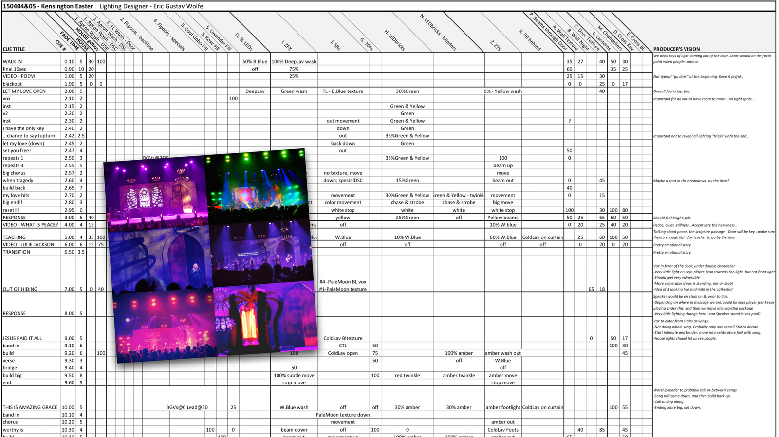
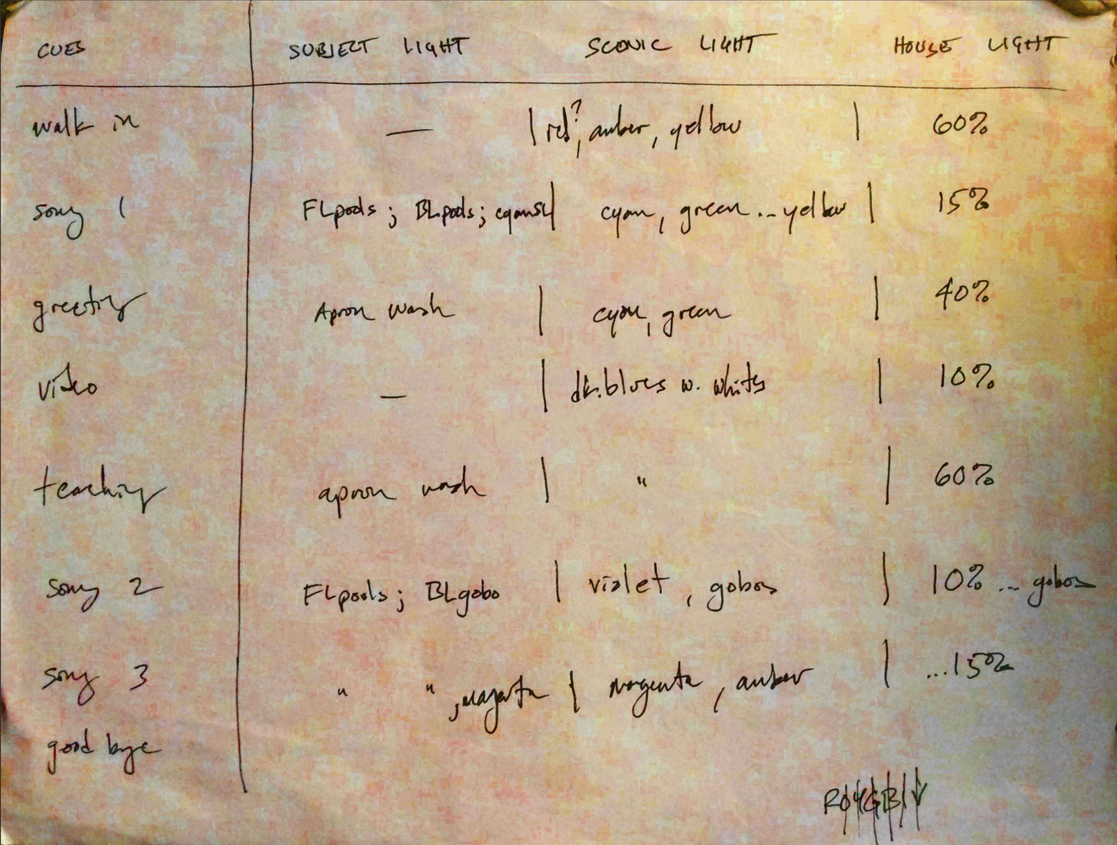
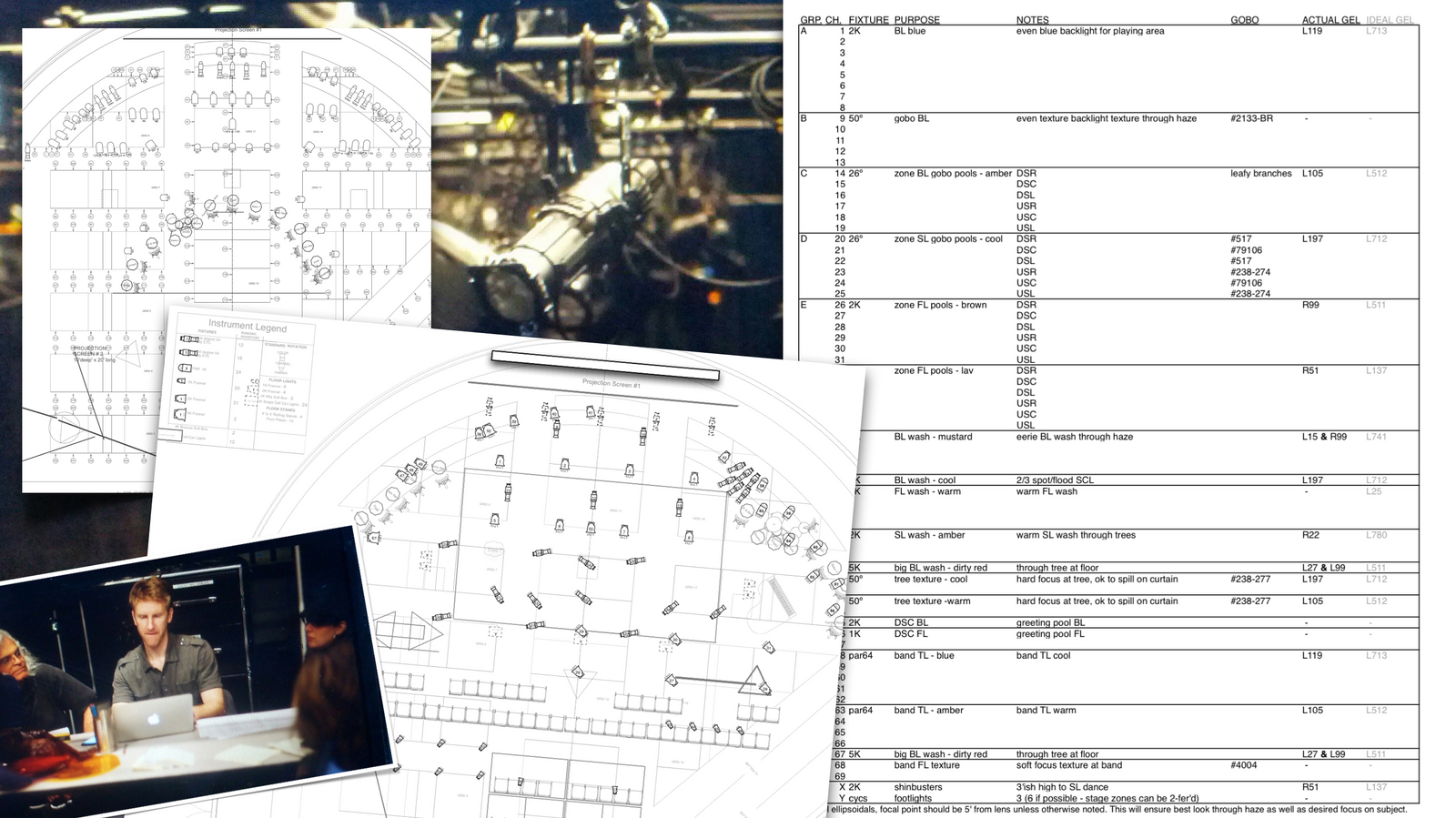
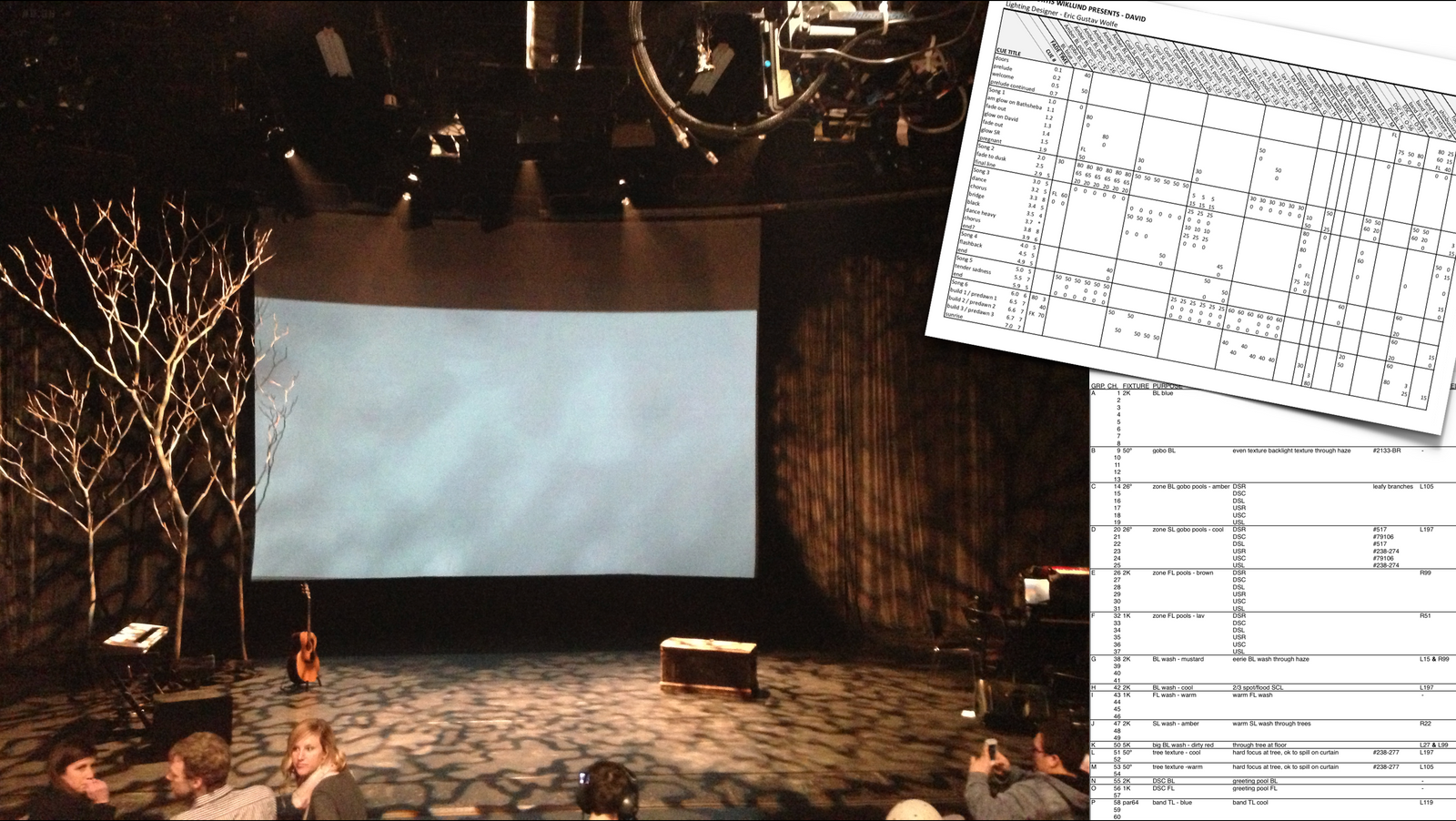
I've had multiple conversations with worship arts directors in the past few months where I've shared some of my thoughts on this subject. As a designer and live production artist, my personal preference loves to create "live," "Spirit led," and "in the moment." I usually do at least some amount of live busking when I operate; some shows more than others. For theatrical productions that repeat a linear story multiple shows I live in a single fully mapped timeline; a worship concert I am almost fully live. Regardless, I always have a road map sketched out (at least in napkin sketch format - see image below) if not fully built in Excel (see other image below) in some format or another. Even if I audible live, at least I'm making a change from something.

Anyway, the thoughts here were built from a copy/pasted note to one of the artistic producers I was consulting with recently. The thread had included his question of if a cue-to-cue would be something I'd recommend to their process. My answer to these questions are about finding best practices for being one in vision and trusting each other to bring the best thing we each can do to create a moving experience.

A cue-to-cue might prove to be beneficial to your process and your product. However, remember that without the context of the live music being played and the musicians on stage in their light, it’s very difficult for someone besides an experienced lighting designer to accurately know how to interpret what they see. I’ve experienced numerous cue-to-cues with producers where they make changes to what the LD designed and then later they ask for follow up changes during the dress rehearsal that end up very close to what was originally created. If doing a cue-to-cue, make sure you know what you're reviewing.

I suggest what is more beneficial is to spend the time making sure that you’re clear in the vision that you have for each moment of the service. Communicate that to the SM and LD. If they understand your vision, they’ll support/enhance the moment visually. Again, a cue-to-cue walk-through isn’t bad - the dialogue to check in and make sure you’re on the same page is really important. Simply heed my caution to not to make changes out of context. Make sense?

The greater importance is trusting each other to all be on the same page. Have you communicated vision for the story clearly? Does your LD have a plan for how to support and enhance? I suggest a meeting to talk through a cue sheet is the better use of everyone's energy. After knowing that you're on the same page, then you can each work on the tasks that you're best at.

Unless you see a specific vision for mapping out the details of an element, I don’t recommend going into detail of builds and changes in each song. Aside from the potential build (referenced with an ellipse) it simply shows the base cue guide for each moment. Feel in the room can and should lead to adjustment in each nuanced moment. Trust the LD to design beauty and magic that supports and enhances the experience.

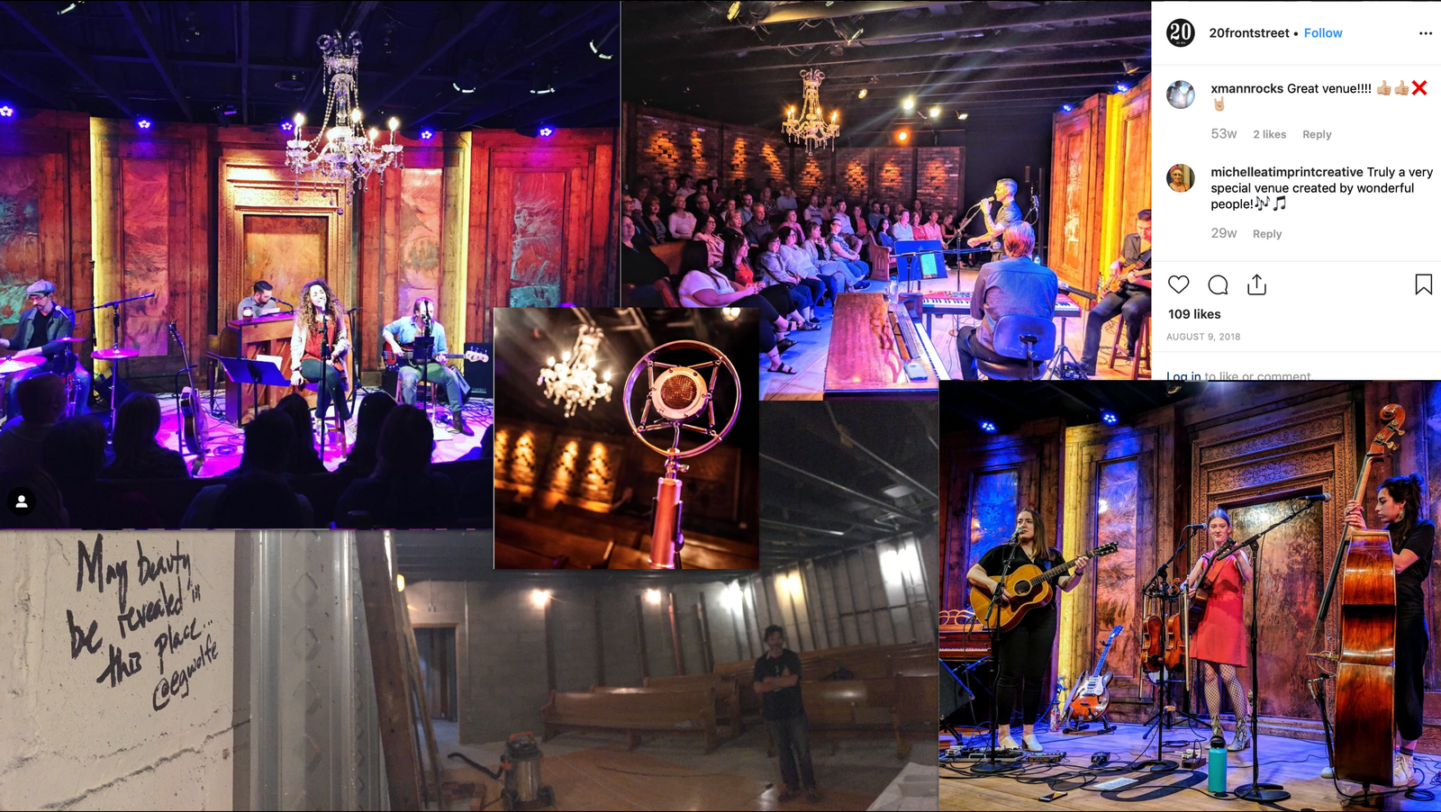
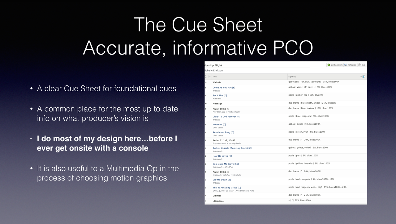
At Kensington, we use Planning Center Online as our hub for every production we do. It’s great for scheduling teams and making sure that everyone is on the same page. I can give coaching in another post about how I suggest it might be a useful platform to incorporate into your process. Anyway, it’s a very useful tool for us in laying out the flow of elements in a service. As a PM, I love being able to think through what each discipline (Audio, Lighting, Multimedia, etc.) needs to be doing at each moment of the service.

In each cue the notes in the lighting column give the road map for what lights will be doing in the format of:
"SUBJECT LIGHT | SCENIC LIGHT | HOUSE LIGHT"
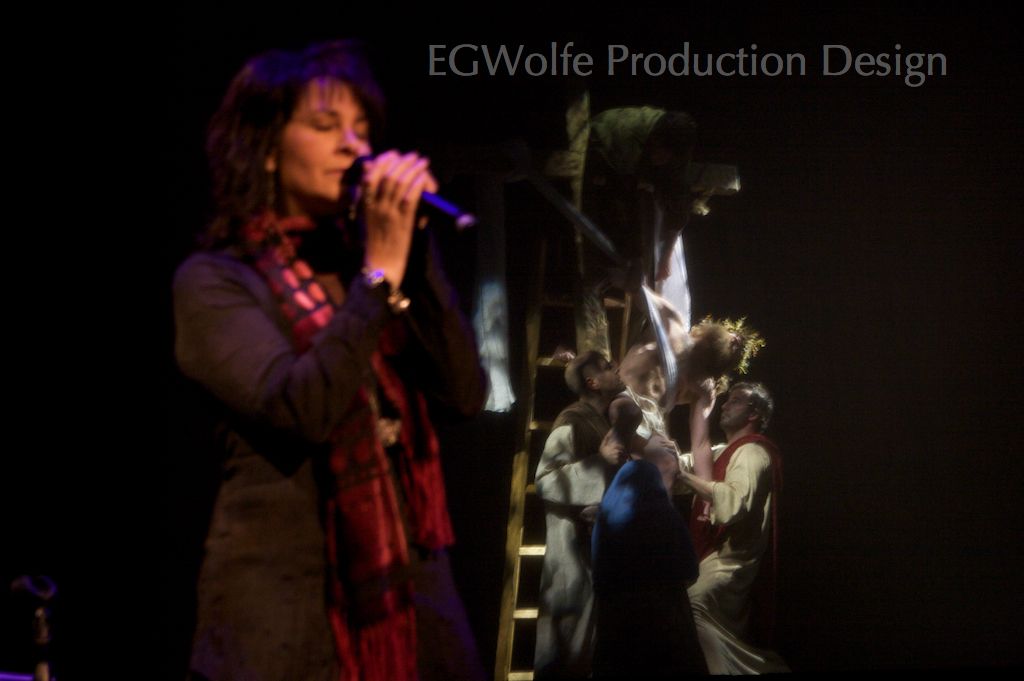
Subject - the communicators and artists on stage
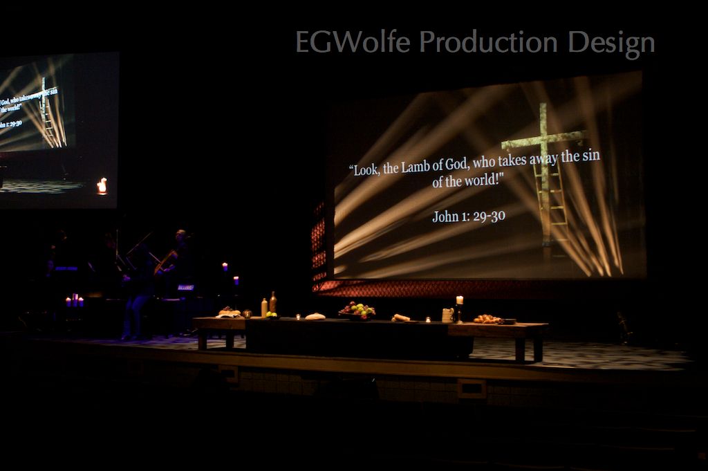
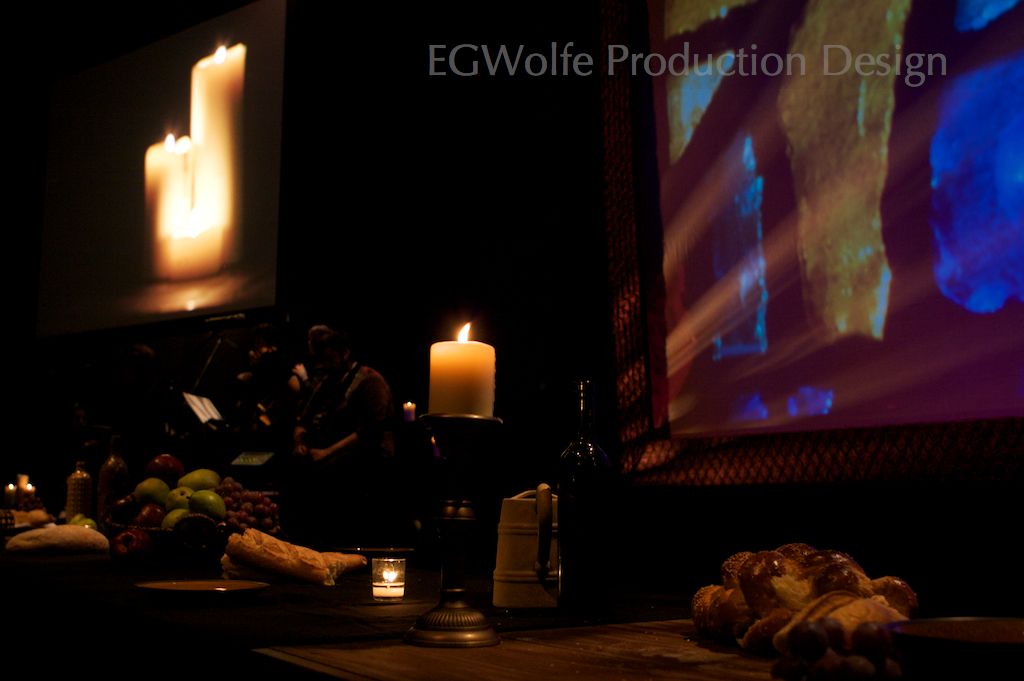
Scenic - everything behind and around the people - soft goods, lights through haze, etc.
House - as simple as basic intensity, but often can include environmental lighting

As an LD, I map out the visual story pretty intentionally. Sometimes a show calls for a fully detailed cue sheet with specific intensities and focus patterns for each instrument along with fade times for each transition. A cue sheet can also be as simple as a napkin sketch. Having these notes shared with the Stage Manager is really important as they're the hub for helping everyone stay true to common vision. Again, I suggest using PCO (or another cloud based service) to make sure everyone can stay updated with any changes along the way...

Do these thoughts make sense? Do you have ideas grow in how you might evolve your process? Please let me know!


Adapting a University Rep Plot

Posted on February 19th, 2013

Lighting Design

This slide is from my Lighting Training slide deck. It illustrates the importance of accurate, thought-out documents and the iterative process of designing at a university theatre for a theatrical production that I was brought in to be the Lighting Designer for.
The document on the left shows the rep plot they were using. Thanks to some great pre-production meetings (and the trust built with the university’s Lighting Director) I was shown much favor and adapted the plot to fit the ambitious creative direction that the producer and I wanted to pursue. The photo shows me in the final meeting with the house LD as he prepared to follow my plot and Purpose Sheet.
Good paperwork allowed him to lead a few of his students to hang/circuit/focus all lights in a 6hr shift.
The student who programmed used my cue sheet to program the show and adapt during rehearsals. I was given trust early in the process; and it was a privilege to give trust to her for the end of the process: The first time I saw my design outside of my head was at the premier of the show!


Dinner With A Perfect Stranger

Posted on August 21st, 2012

Scenic & Lighting Design

This was one of my earliest theatrical designs. It was a privilege to be invited to this project and bring the book to life on the stage. The following illustrates the process of creation:
  1. Read the script (still in rough version adapted from the book)
  2. Ideate with the Producer and Director
  3. Research Italian restaurants
  4. Sketch concepts
  5. Development and refinement
  6. Scale drawings
  7. Texture, paint, functionals, decor
  8. Custom table design tilted downstage slightly for audience
  9. Lighting Design
  10. Additions of floor and pillar
  11. Sign off on build process and finishing details like paint, texture, stain, electrical, etc.
  12. Transportation entire set has to transport in trailer, fit through standard doors, and setup/strike quickly for multiple venues
  13. Oversee setup and lighting focus
  14. Program lighting


Good Friday 2011 Production Design

Posted on April 25th, 2011

Kensington Good Friday 2011


For Kensington's Good Friday service this year, there was a powerful moment at the end where live poses portraying scenes from the crucifixion were revealed. Until that moment, the audience had been taken on an artistic journey from walking in to simple beauty with a simple stage containing only a decorated table, a piano and string section, some candles, and screen.


The screen was the key to the design. It was the focal point for a powerful video early on in the day. It also supported songs and teaching with graphics with lyrics and scripture projected on it. However if that was all that it was used for, we would've just used a standard video screen.


Our screen was a custom frame for a RoseBrand Gray Sharkstooth Scrim. The *frame was built out of plywood and wrapped in Burgundy Pinched Taffeta for color and texture. The interior dimension was 19' wide and maintained a perfect 16:9 ratio for projection.


Behind the scrim was a 32" high 20'x8' stage with a cross (capable of supporting an actor) that rose 10' above that. Scrim is a magical material. It behaves much like a standard soft good when lit from the front. However, with only a simple lighting cue, actors are revealed in a stunning way.


The trick to achieving a Renaissance inspired scene is less **light, not more...


The Good Friday service is really only the secondary event for the holiday weekend. Easter is trump. I had to design the GF set to work on the same stage as Easter's. Much of Easter's design lived upstage of the closed mid traveler. The rest was hidden behind a temporary curtain made out of strips of RoseBrand Black Duvetyn. The double intent was to create a black void of negative space to allow the story focal points to pop.

They did. It was a powerful service.


*The frames were shipped to each of our five campuses in trailers; and therefore had to be shipped in 4 pieces and assembled at each location. The scrim was then stretched over cardboard and stapled into place.

**Because of the tight timeline (only a few hours!) that our portable campuses had for setting up and programming we rented 4 Martin Mac250s for every campus. This allowed us to fine tune our cues (specifically the nuanced cues for the poses) at Troy Campus' rehearsal and send a cue sheet and photos to the campuses. This let them quickly program in those values and be 95% there.

***We used no haze for this service. That's very rare for us, as haze is a prominent part of our brand. I wanted to create a sense of focus on what was being lit, rather than the beams of light.

Eric G Wolfe

Creative Director | Process Architect. Design Strategist. Leadership Coach.