Production Design - not a fan.
Posted on September 8th, 2013
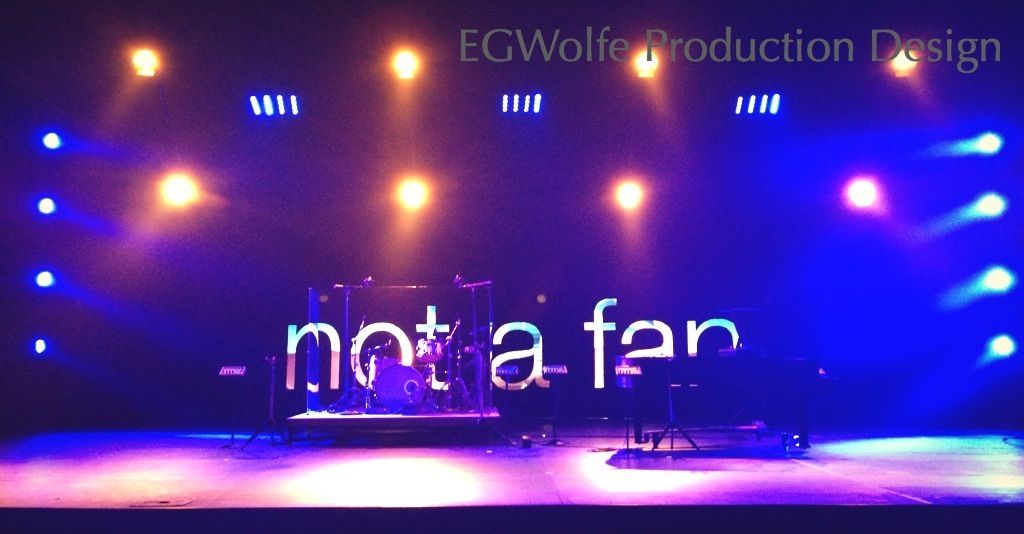
Kensington is doing a 4-week series based off the book Not a Fan. The Communications Department has gone with the same branding as the book. Simple white text on black.
We decided to play off the same design by creating a 32' wide black rectangle with cut-out letters. We're using the same typeface as the program and lobby graphics. The fun thing I'm doing with it is having the letters glow with saturation - and motion texture as we're using projectors to light the letters. Add some lights and we have a design. Simple is good, usually. It'll be great for the walk-in and even during communication moments. I'm concerned about the sensitivity of a closing song. The other departments think it'll be fine. Perhaps I'm just a bit cautious of sabotaging such a moment. We'll see I guess.
Ingredients:
- Foam-board (held up by jack-stands and tape)
- Visqueen
- Projectors (to see video of what they do, visiting http://egwolfe.tumblr.com/post/60597727024/this-weekends-productiondesign)
- Hanging lights
-
- S4ParN with tough spun and barn doors
- clusters of LEDbricks
- LED movers mounted to side of truss
*Oh, and you should ask me about the idea we almost went with. It might have been a bit cliché, but I know our teachers would have loved it. A bit too much to try and do with our timeline (I was scheduled for vacation and we're in the middle of Christmas prep) so I've back-pocketed yet another design. I think it would've been pretty amazing...
